Introduction
21shares is one of the leading names in crypto-backed exchange-traded products (ETPs). As part of their rebranding, I was responsible for shaping the new creative direction - designing the logo, defining the brand’s color palette and typography, and establishing a cohesive illustration and iconography style. Additionally, I created animations to support the brand’s launch, ensuring a dynamic and modern visual identity.
Challenges
Rebranding a fast-growing fintech brand operating in the highly volatile crypto asset space, while maintaining the trust of institutional investors.
Creating a visual identity that felt both innovative and established—balancing the disruptive nature of crypto with the reliability expected in traditional finance.
Aligning internal teams around a bold creative shift in an industry where risk-aversion often dominates communication strategies.
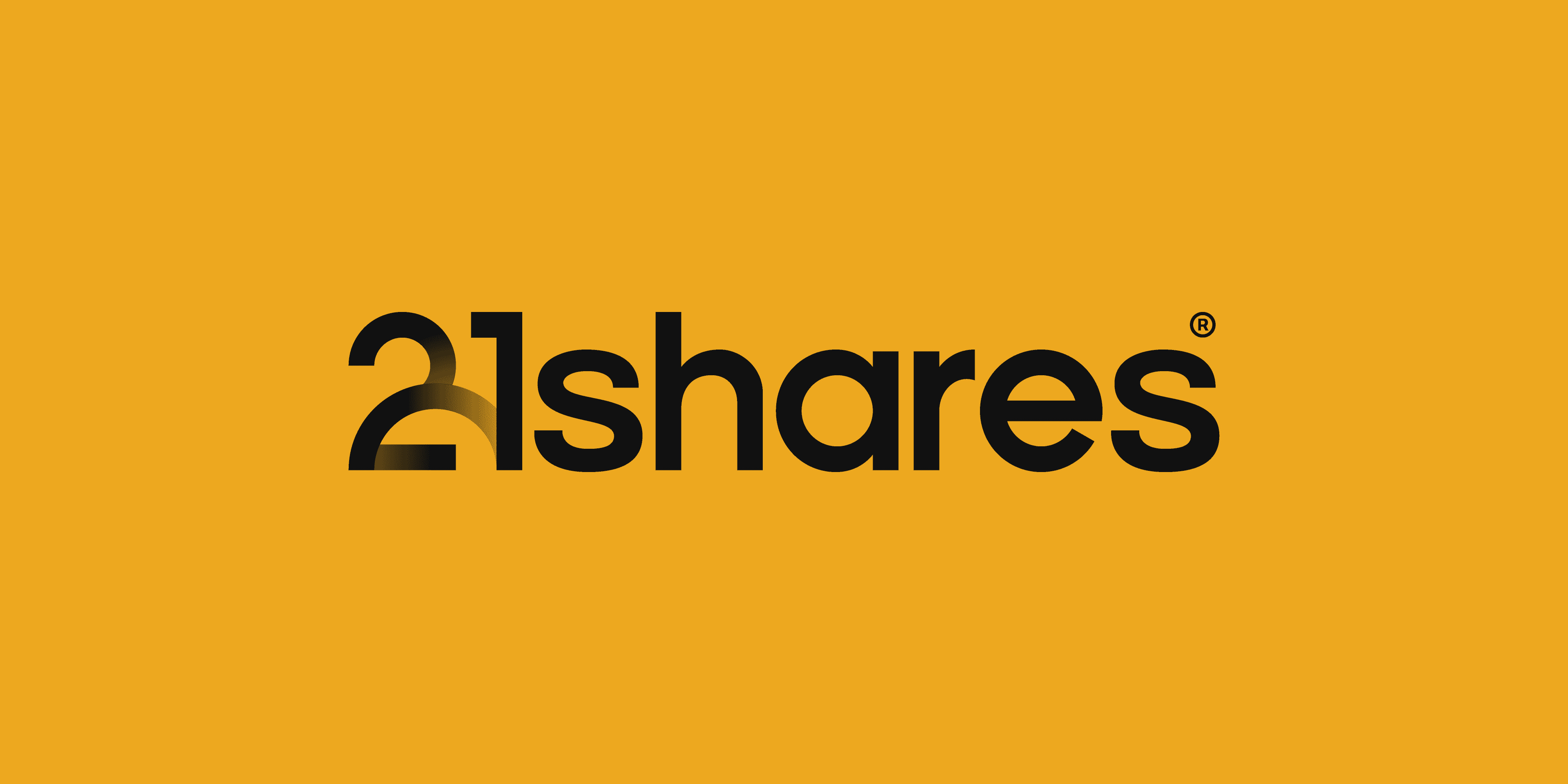
Logo
The logotype includes the 21 symbol to clearly establish it's a brand under the 21.co umbrella, which introduced a new brand hierarchy earlier. The rest of the wordmark has been custom designed in a similar fashion as the logotype of the parent company.
The number 21 holds significant symbolism in the crypto space, most notably referencing the total supply of 21 million Bitcoins. However, the arc in the logomark carries a deeper, less common meaning.
It represents the journey from the two financial systems we navigate today - traditional finance and decentralized finance - which often clash or operate independently, towards a unified system that blends the strengths of both. The arc also embodies the concept of a bridge, reflecting the slogan of the parent company - "building bridges into the crypto world."


Product symbols
The previous system used the actual logos of various cryptocurrencies, resulting in a chaotic mix of dozens of colors. This approach lacked consistency and didn’t align visually with the 21shares brand.
I redesigned the entire icon set with a unified approach - using a single brand color and a consistent construction grid. This created a cohesive, minimalist visual language that reinforces 21shares’ identity, making the icons more recognizable and memorable. Instead of highlighting individual assets, the new system emphasizes the strength and clarity of the brand itself.
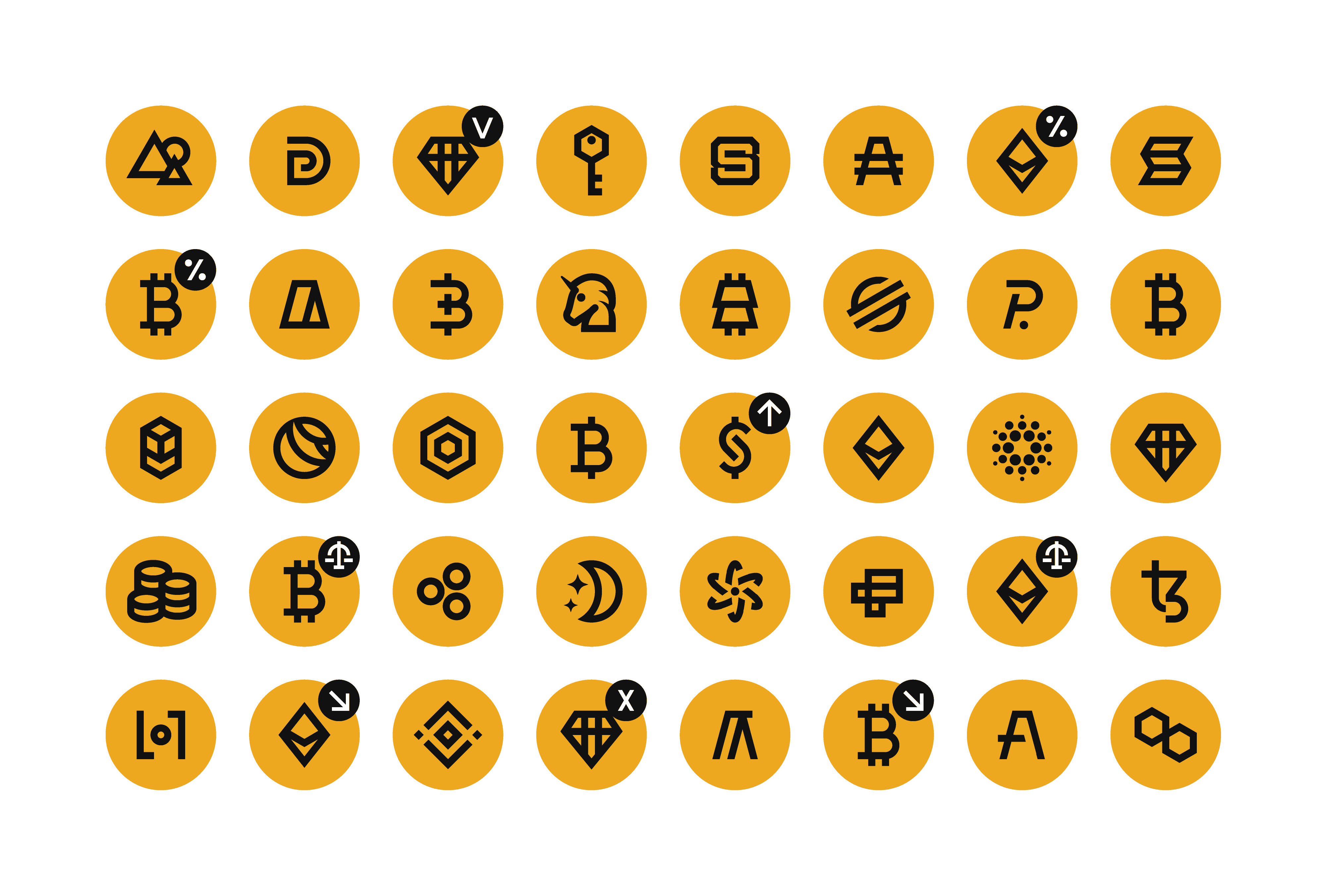

Illustration style
To complement the modernist brand elements, I developed a custom illustration style rooted in geometric abstraction and inspired by architectural forms. The visuals use a limited palette of black, white, and the brand's signature yellow to maintain clarity and impact, while patterns and clean linework reference both classic print aesthetics and modern digital systems. The result is a future-facing, structured world that reflects 21shares’ position at the intersection of traditional finance and innovation.


Icons and illustrative icons
To support both product pages and editorial content, I developed two complementary icon systems. The first is a minimal, monoline set designed to clearly communicate product features in a clean, unobtrusive way. The second is a more expressive, illustration-style system used in hero sections and key messaging areas, often accompanied by supporting copy. Both sets share the same underlying grid and stroke logic, ensuring consistency across the brand while serving different functional and visual purposes.


Credits
Creative direction:
Marina Krutchinsky,
Neil Russo,
Jerzy Zaręba
Brand design:
Jerzy Zaręba
Iconography:
Jerzy Zaręba
Illustrations:
Jerzy Zaręba
Motion design:
Jerzy Zaręba